FUJIFILM Explains their Color Science and Film Simulation
Japanese blog DC.Watch has published a two-part interview about film simulation and color science with Kosuke Irie, the Technical Manager, Optical and Electronic Video Product Development Center, and Shinya Fujiwara, the Optical and Electronic Video Product Development Center on FUJIFILM.
We think that this kind of content is like little gems able to understand better how manufacturers think and approach color in photography.
Below is a summary of the translated interview:

The core of image quality:
Image quality is about four elements: Color, Sharpness, Noise, and Graduation that you can break down further, but these elements must be in balance for good results. When making a new simulation Fujifilm thinks “Are each color and each gradation pointing in the same direction?”.
For example, during Classic Chromes development the dark red channel didn’t look as vivid as other channels to the human eye so it was pointing in a different direction of being designed to look vivid for documentaries.
It’s very difficult to set goals for developing looks especially since the cameras differ so much with new sensors and processors or even different IR/UV cut filter differences, for example, it is impossible to make the X-T2 and X-T3 produce exactly the same film simulation results so all they can do is make users comfortable with the look. Fujifilm tried to design from the hardware up to provide a consistent comfortable look.
Origin of film simulation:
Fujifilm developed simulations because they were criticized for their images having a digital feel and customers didn’t expect that from a film company. The FinePix S100FS came out in 2008 and was the first camera with film simulations under real names, but even back to the FinePix S3 Pro in 2004 Fujifilm had standard and F Chrome Mode for film simulations, which was the origin of film simulation.
About film simulation:
Irie would like to find a better word than film simulation for Fujifilm’s film profiles because they aren’t necessarily trying to replicate film as much as creating good images so to him the label isn’t necessarily accurate. So, Film Simulation is not a copy of the film, but to achieve an image quality goal that has existed since the era of the film of overall image quality.
For example, ASTIA is aimed at achieving the same goals as silver halide film ASTIA, but digitally there are no restrictions on silver-halide and there are other disadvantages that have lead to simulations like digital ASTIA realizing what silver salt could not do.
Irie doesn’t like to call ASTIA software, but that’s the terminology used internally. Its design intent is to reproduce soft skin with the intent of reproducing bright skin tones with smooth skin tones, but silver halide film ASTIA sometimes looks softer overall.
The “software” branch of ASTIA should just be considered ASTIA without calling it soft because it is designed to be closer to the ideals ASTIA film was based on and starting with the X-S10 Fujifilm is trying to better explain its simulations.
We can do anything digitally, but Irie and others think film might have a significant advantage in terms of color continuity.
Film is superior for capturing color information, but digital is better for gray linearity since it can be expressed as a complete grayscale.
It’s very easy to do White, Black, and Grey with digital with great levels of accuracy because of the way the sensor captures light.
We know with silver halide film the shadows start to turn blue while highlights turn yellow.
Film can obtain ambiguity and express color continuity with good tone connection that provides a beautiful reproduction that is very difficult with digital, for example, there is nothing quite light positive film shot underwater with its very deep beautiful blue.
We still have a lot to learn from film: Color Chrome is based on Fujifilm’s efforts to reproduce the deep color expression of films like positive film and it works by suppressing the development of some colors to create deep color reproduction.


Approaching color reproduction of film simulation:
Film simulations try to ensure a degree of accuracy and colorimetric that is tuned for comfort and natural reproduction, like faithful color reproduction for skin tones or the color of a car.
Faithful colors must be perceived as the same color when compared to the actual scene so this is where memory color comes into play because you need color reproduction to fall between numeric accuracy and memory color for it to be accepted, which makes the image feel like “the same color” when they are viewed alone.
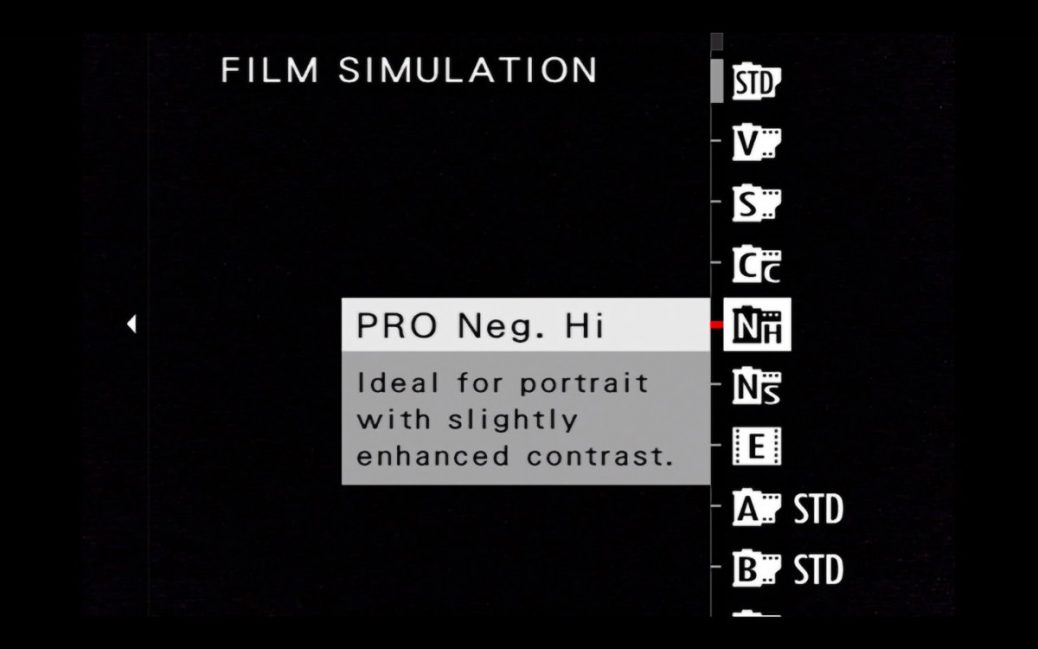
PRO Neg. is the closest to colorimetry in film simulations. PRO Neg. Hi and Pro Neg. Std are mainly different in the tone curve with high having tight shadows and highlight, but the colors have the same design.
“The design intention of PRO Neg.Hi and PRO Neg.Std is to consider the difference in studio lighting.”
PROVIA, Velvia, and ASTIA have a magenta tendency that helps bring out blue skies, which is more effective than colorimetry. Classic Chrome skin tones are created by part of a cool image that is shifting to warm. ETERNA is based on cinema ETERNA film which can make the sky look a little greenish-blue until it is projected on the big screen.
A little Magenta should be added to ETERNA when using it for photography to make it look good and impressive, but in video, you need the opposite.
“The difference between movies and photographs is that not only the pictures move, but there are also “sounds” such as dialogue and music.”
So if an image is too impressive it can throw off the balance between the film, dialog, music, etc…
In cinema, the sky is deemphasized to with greenish-blue to make it less of a distraction. Classic Chrome also deemphasized the sky and can be used as a film simulation for cinema.
Classic Negative is a special film simulation, and it is designed so that the appearance of colors changes depending on the brightness, so dark tones get cyan boosted and bright tones get magenta boosted like film. Once again digital allows Fujifilm to realize their ideas by allowing for this kind of adjustment, which film couldn’t achieve.
Classic Negative gives you the feeling you get when you look at a color negative after more than 10 years. It’s not hard to do these kinds of auto adjustments, but it is hard to do without fail.
“For example, even if you take a picture of a person’s face in one scene, there are many tones from highlight to shadow, so if you just turn the color according to the brightness, the skin tone is neutral in the halftone, but the shadow is green. The highlight becomes magenta, something like that happens in one face and it becomes a collapsed reproduction. It was really difficult to arrange such “directions for each color” and express film-like nuances within a range that doesn’t break down.”
When we think at grain, there are two ways to do digital grain, one is dithering, which uses random dots, but it gives off a digital order so Fujifilm makes it look natural by applying a process that looks grainy based on the sensors noise that gives a natural organic feeling like film.
Fujifilm has two-grain looks that make it look comfortable, one is image processing to make noise look grainy and the other is the film simulation grain effect, which has different nuances. The grain effect from the simulation is randomly generated using a pseudo-random number generator circuit designed with great care mathematically and visually, which is what makes it different from the noise looking like grain effect.
The thought is that humans find images that are too uniform to be artificial and unnatural so adding a little noise can have a positive effect since the human eye forms perceptions from the noise.


How to make a film simulation:
Some simulations are attractive worldwide like Classic Chrome, but others like Classic Negative are designed based on Japanese ideals.
When they design film simulations they are designed in Japan though so when they think of blue skies they think of Hawaii.
Fujifilm doesn’t like to move off the standard of 18% gray based on the film days, which is why they do not have an automatic graduation correction function like other companies, so if you want to move outside of the scene recognition auto mode you need to adjust exposure and dynamic range.
The measurement data is exactly the same with the GFX series and the X series cameras.
The dynamic range on the highlight side is more difficult to overexpose on the GFX which accounts for some differences in look.
From the impression of each film simulation:
When it comes to PROVIA photographers that started with film find it hard, but photographers that only shoot digitally find it just rights.
PROVIA aims at the greatest common divisor that makes you feel “beautiful” at a glance, but Irie agrees that it is slightly hard by default.
Some suggest to use Provia with shadows, highlight and color at -1.
Velvia was difficult to develop because color saturation would be a problem in ultra-high saturation subjects especially on early Fujifilm cameras, but it got far better from the X-Pro2 on.
If you have a camera that supports Color Chrome effect the depth of color will increase dramatically if you enable a weak color chrome effect
Velvia lacked color depth compared to silver salt Velvia, so if you apply the color chrome effect it is more ideal and closer to Velvia.
Velvia’s green shadow should be blue.
You can’t adjust film simulations to look similar to each other because the color balance is really different.
You should think about film simulations like changing film in a camera, because they are that different.
All film simulations have different color tiles for each lightness and they are designed to change smoothly in three dimensions.
PRO Neg. is not straight, but it is straight forward which makes it easy to handle. ASTIA is designed to improve the balance of saturation between people and landscapes, so it is best not to change the settings too much.
Monochrome is based on the grayscale of PROVIA.
ACROS is tuned to perform based on the spectral sensitivity curve of film reproducing gray tones in relation to color, which is different than Monochrome.
Fujifilm is sensitive to longer wavelengths of red because it is necessary for starscapes and it is easy to design if you cut around 650nm.
Irie would like to make changes, but many of the choices about color come down to what a beginner might do and what a professional would want.
If that is too flashy PRO Neg. Std with +2 color, which Irie feels is halfway between what is impressive at first glance and what makes you feel comfortable looking at it all the time.
In other modes, Classic Negative has a larger grain effect with strong intensity and maximum sharpness on the negative side which makes it shine.
ETERNA Bleach Bypass is like half the bleach bypass of the film so it might look a little off from what is expected for a photographic work.
If you want to use ETERNA Bleach Bypass for pictures you can set the tone control shadow to +3, highlights to +1, and color to -4 which makes the tone harder and the color lighter.
Irie thinks of color depth as color tone
Fujiwara thinks color dept is tonality involving brightness, hue, saturation, and how gradually and smoothly they transition.
Color Chrome effect was born to express the depth of color by contrasting brightness and saturation of dark colors and it does not just reduce the brightness of dark colors.
Differences in color tone make photos look 3D and if you lose the transition the image becomes flat-looking.
The film simulation development team is not made up of silver halide experts, but they have learned from the experts at Fujifilm what is the comfort of images.
If Fujifilm didn’t have a history with silver halide they probably couldn’t have developed such great simulations, because they wouldn’t know how to talk about color. It’s easier to catch up to other companies with the digital generation.